


Lonely Planet UI
This case study is a work in progress. To find out more contact me


The process of simplifying
complicated UI
When I began my tenure at Lonely Planet in 2012; the main challenge was particularly clear. How do we aggregate and simplify the enormity that is the Lonely Planet website. Development wise; besides the other obstacles the frontend engineers faced; the current convoluted UI were creating an increasing amount of tech debt as there was no clear patterns to allow proper componentization.
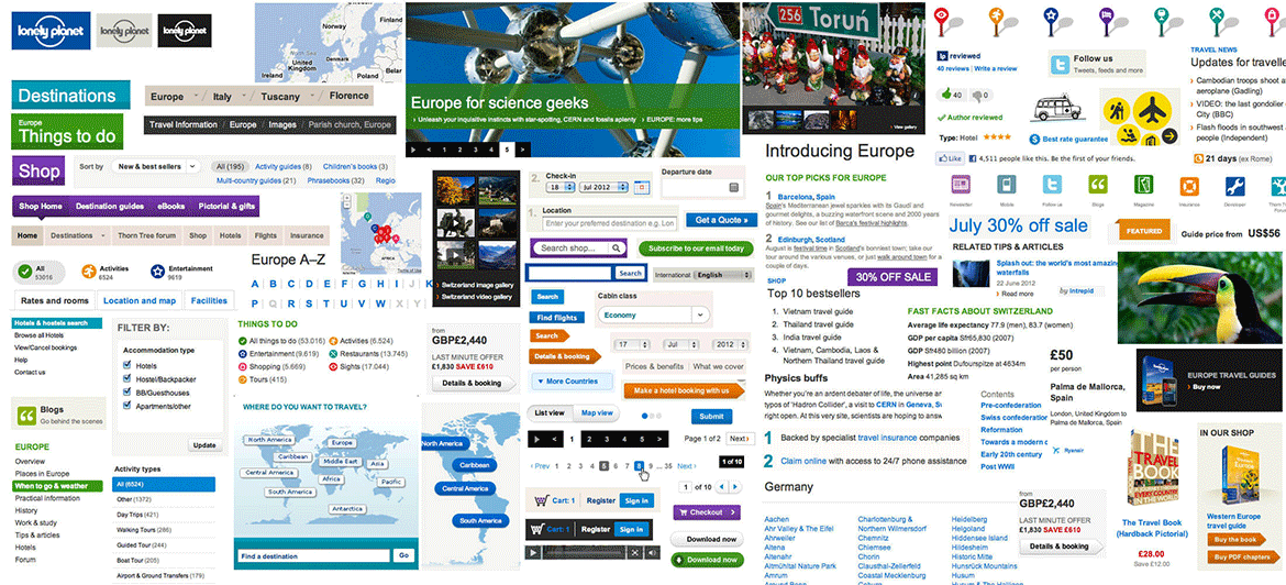
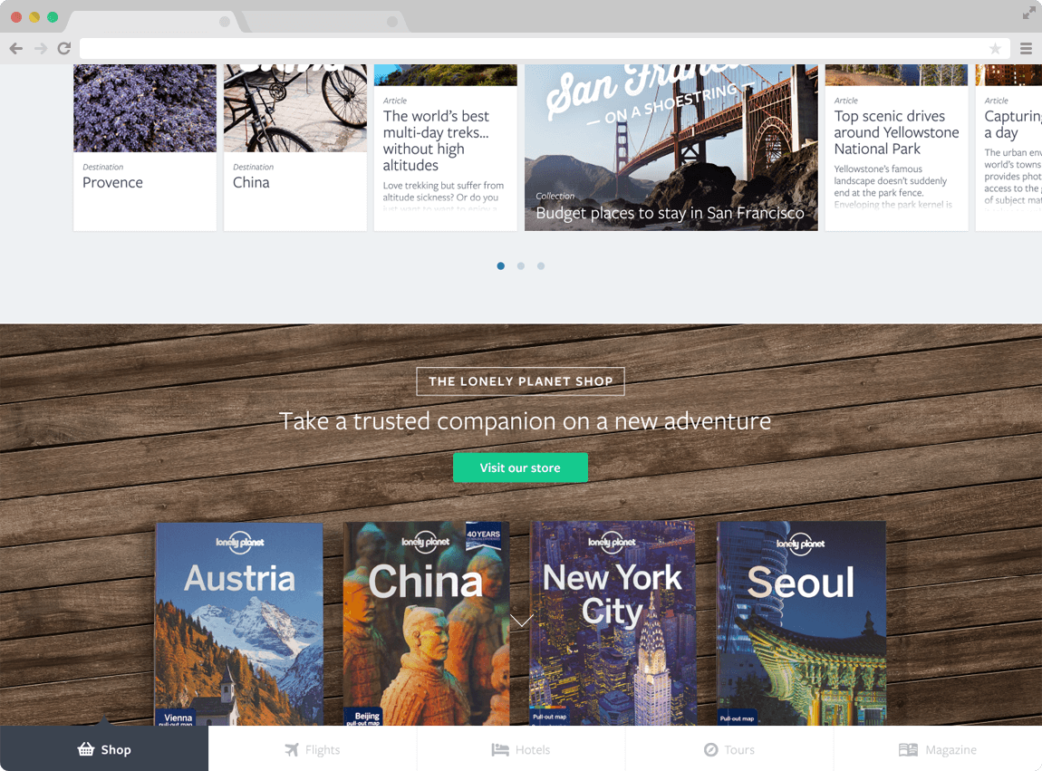
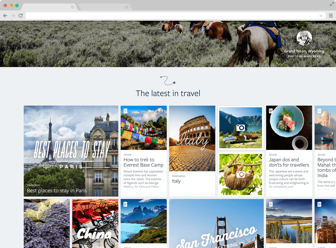
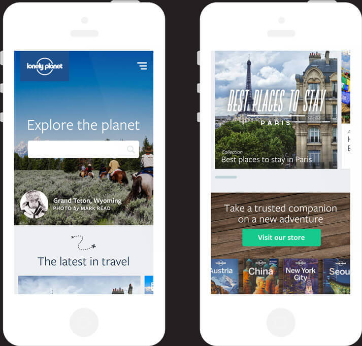
An audit of the old UI

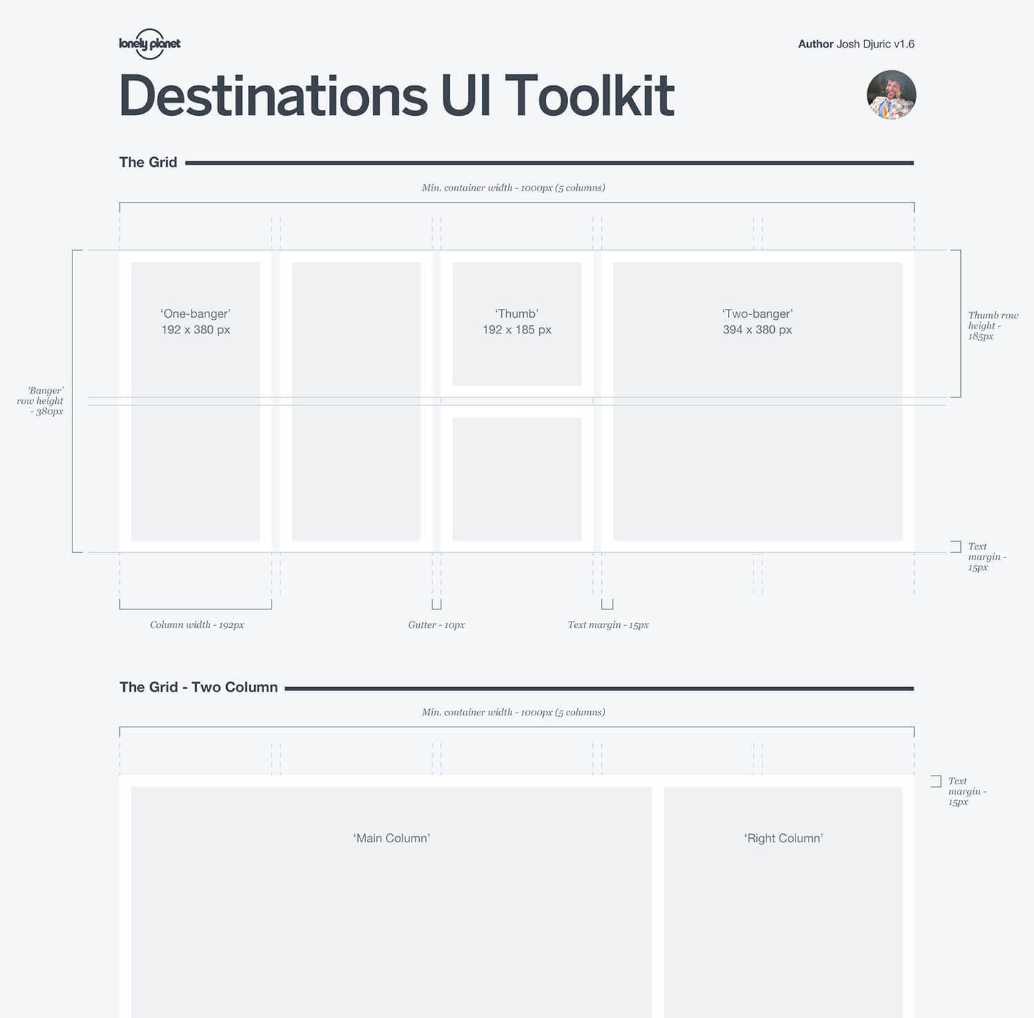
Re-defining the UI Patterns
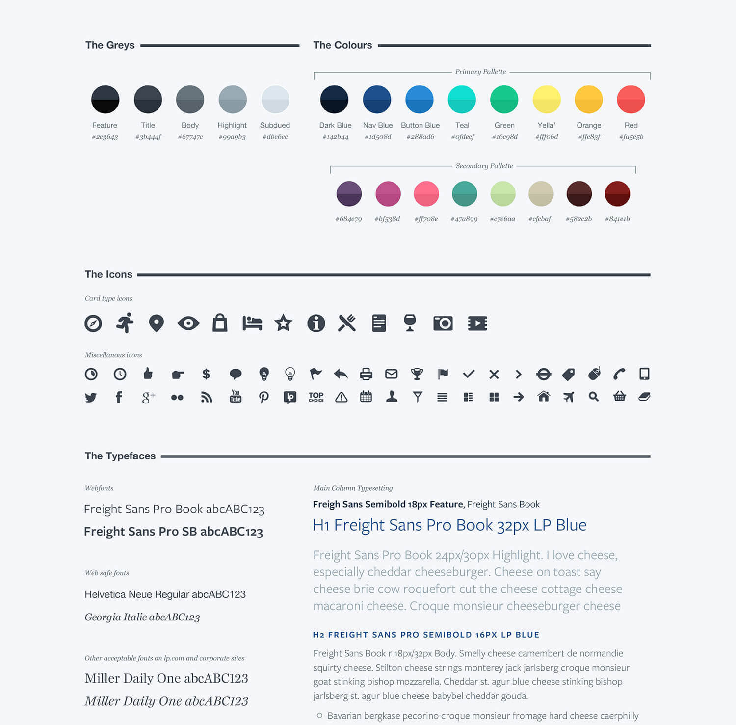
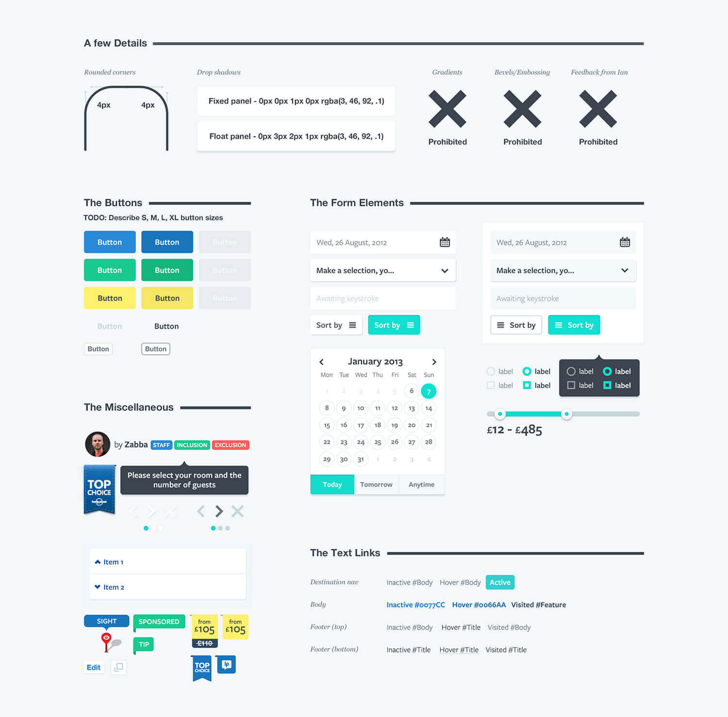
In order to move forward and re-build we had to create a new set of UI patterns. I began by designing a simple set of UI; a flexible grid, defined colour palette, a proper text hierachy with selection of new typefaces (limited to two speciments to reduce page load), iconography and a typical set of UI components (e.g. buttons, inputs etc.). The goal was simplicity. Keep complexity and development time to a minimum.

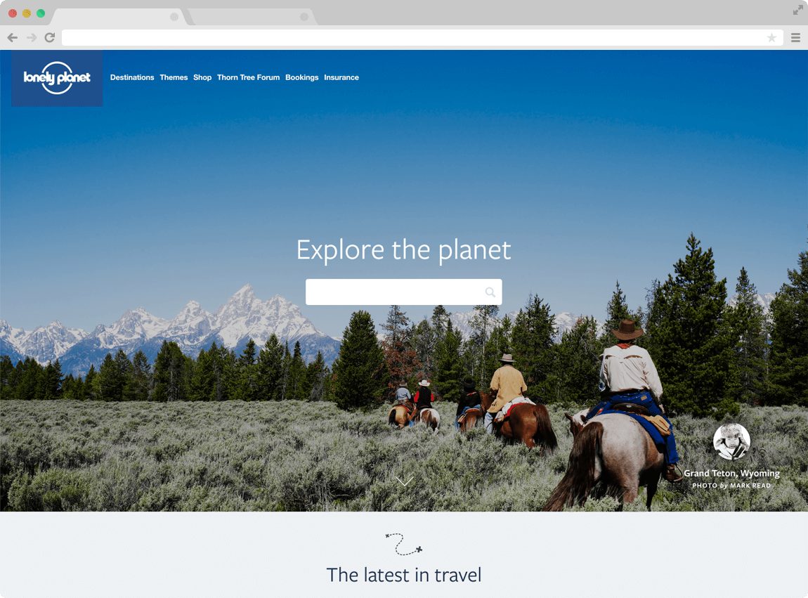
A demo was created to showcase potential UI advances
(Apologies for the music...)
Making UI changes sustainable
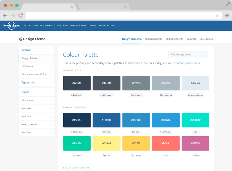
Another goal was to ensure that UI guidelines weren't simply housed in the age old PDF or PSD. These tend to rapidly become dated with and sometime keeping on top of versions can become un-manageable. I was forunate to work with some clever frontend engineers lead by Ian Feather; who conceived a way to turn the rapidly transforming UI into a living, breathing component library. The result was rizzo; a maintainable UI styleguide for lonelyplanet.com.


Featured by apple